



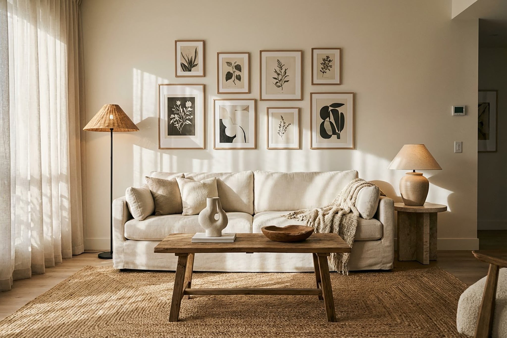
That nagging feeling your room isn't quite right? It's probably not your taste — it's one of these fixable mistakes.
You've bought decent furniture. You've chosen colours you genuinely love. Yet something about the room still feels… off. A bit flat. Maybe even a bit cheap — though you'd never use that word out loud.
Most design mistakes that make your home look cheap have nothing to do with how much you spent. They come down to proportion, placement, and a few styling choices that are surprisingly easy to get wrong — and just as easy to fix once you know what to look for. A too-small rug, art hung at the wrong height, or a single overhead light can quietly undermine a room that's otherwise well put together.
These are the nine most common offenders, along with specific fixes you can tackle this weekend without spending a fortune or picking up a paintbrush.
Your Rug Is Too Small for the Room
This is the single most common mistake in living rooms, and it's the one that costs you the most in terms of how the space feels. A rug that's too small makes every piece of furniture around it look disconnected — like islands floating in a sea of bare floor. The room immediately feels unfinished, no matter how nice each individual piece is.
The fix is straightforward. Your rug should be large enough that at least the front legs of your sofa and chairs sit on it. For a standard living room, that usually means a rug of at least 240 × 300 cm. For a dining room, the rug should extend at least 60 cm beyond the edge of the table on all sides — enough that chairs stay on the rug even when pulled out.
A common objection: "But larger rugs are expensive." True, but a well-sized rug in a simple weave will always look better than a small, ornate one that leaves half the room bare. If budget is tight, a natural jute or wool rug in a generous size beats a designer rug that's two sizes too small. We cover specific sizing guidelines in our guide on how to choose the right rug size.
Why Is Your Art Hung So High?
Art should sit at eye level — with the centre of the piece roughly 145–150 cm from the floor. That's the gallery standard, and it exists because art viewed from a comfortable angle feels intentional. Art hung too high feels like an afterthought stuck up near the ceiling.
Above a sofa, the bottom edge of the frame should sit about 15–20 cm above the backrest. Above a console table, the same rule applies — close enough that the art and the furniture read as a single composition, not two unrelated elements stacked vertically.
The reason so many people hang art too high is that they eyeball it while standing right underneath. Step back to where you'll actually view it from — across the room, from the sofa, from the doorway. That's the perspective that matters.
One Overhead Light Is Doing All the Work
A single ceiling light casting even illumination across the entire room is the fastest way to make a space feel flat, clinical, and — frankly — like a waiting room. Interior designers call it "overhead-only lighting," and it's one of the simplest problems to solve with the biggest visual payoff.
Good lighting works in layers. You need three types working together: ambient light (your overhead fixture, dimmed down), task lighting (a reading lamp, a desk light), and accent lighting (a table lamp on a console, a candle cluster on a shelf). Each layer adds depth and shadow, which is what gives a room warmth and dimension. A 2024 survey by the American Lighting Association found that rooms with three or more light sources were rated 62% more "inviting" by respondents than rooms with a single overhead fixture.
Start with two table lamps placed at different heights in the room — a natural-material table lamp on a console and another on a side table is an easy starting point. That alone transforms the atmosphere after dark. For a deeper look at how to build a layered lighting scheme room by room, read our guide on how to layer lighting properly.
Does Everything in Your Room Match Too Perfectly?
Buying an entire room's furniture from the same collection — the matching sofa, loveseat, coffee table, and side table, all in the same finish — doesn't look curated. It looks like a catalogue page. Real rooms that feel lived-in and considered have pieces that complement each other without being identical.
The rule of thumb: stick to a shared colour palette or material family, but vary the shapes, eras, and textures. A mid-century walnut side table next to a linen-upholstered sofa next to a ceramic table lamp works because the pieces share warmth and simplicity without being copies of each other.
This applies to metals, too. Mixing finishes — brushed brass handles alongside a matte black lamp base, for instance — adds visual interest. The key is limiting yourself to two or three finishes maximum, so it reads as deliberate rather than random.
Too Many Small Objects, Not Enough Breathing Room
Cluttered surfaces are the silent killer of otherwise good rooms. A shelf crammed with tiny objects, a coffee table buried under candles and coasters, a windowsill lined with miniature vases — each one adds visual noise that makes the brain work harder to process the space. The result feels chaotic, even if every individual piece is lovely.
The rule of three in decorating is your best friend here. Group objects in threes — varying the height, shape, and texture of each piece so the arrangement has rhythm. One tall element (a vase or a candlestick), one medium (a small sculpture or a stack of books), and one low (a decorative dish or a small plant). That trio creates a focal point without clutter.
Then — and this is the harder part — leave space around the grouping. Empty surface area isn't wasted space; it's what lets the pieces you've chosen actually register. A shelf with three intentional objects and 40% open space looks infinitely more expensive than one packed edge to edge. If you're looking for tips on arranging objects with intention, we wrote a full guide on how to style decorative objects.
Ignoring Scale and Proportion
A delicate side table next to an oversized sectional. A tiny lamp on a large console. A narrow bookshelf in a room with high ceilings. When the scale of your pieces doesn't match the scale of your space, everything feels slightly wrong — and most people can't articulate why.
The two-thirds rule is a useful shortcut. Your sofa should be roughly two-thirds the length of the wall it sits against. Art above furniture should span about two-thirds the width of the piece below it. A table lamp should be roughly two-thirds the height of the surface it's next to (measured from the floor). These aren't rigid formulas, but they give you a proportional starting point that almost always looks right.
Pay special attention to lampshades. An oversized shade on a slim base looks top-heavy; a tiny shade on a chunky base looks cartoonish. The shade width should roughly equal the height of the base for a balanced silhouette.
Curtains That Stop Too Soon
Curtains that end at the windowsill — or worse, hover a few centimetres above the floor — make the ceiling feel lower and the window feel smaller. It's one of those details that subtly cheapens the entire room without you being able to pinpoint exactly why.
The fix has two parts. First, hang the rod 10–15 cm above the window frame, or as close to the ceiling as possible — a principle backed by the American Society of Interior Designers, who recommend mounting hardware as near to the ceiling line as practical. This draws the eye upward and makes the room feel taller. Second, let the curtains skim the floor or "puddle" by 2–3 cm. Anything that hovers 5 cm or more above the ground looks unfinished — like a pair of trousers that are too short.
Width matters too. Each curtain panel should be 1.5 to 2 times the width of the window it covers. Skinny panels that barely cover the glass when drawn look flimsy. Full, gathered curtains — even in an inexpensive fabric like cotton or linen — always look more considered.
How Do You Mix Patterns Without It Looking Messy?
Most people either avoid patterns entirely (safe but bland) or pile them on without a system (bold but chaotic). Learning how to mix patterns in home decor comes down to one principle: vary the scale while keeping the colour palette consistent.
Start with three patterns at three different scales. A large-scale pattern as your anchor — maybe a bold botanical on a cushion or a wide stripe on a curtain. A medium-scale pattern for support — a geometric print or a more detailed floral. And a small-scale pattern as a textural accent — a pin-dot, a fine herringbone, or a subtle weave. Keep all three within the same colour family (say, warm neutrals with terracotta accents), and they'll feel cohesive rather than competing.
The mistake most people make is mixing patterns of the same scale. Two medium florals next to each other will always clash, no matter how carefully you match the colours. But a large floral next to a fine stripe next to a textured solid? That works — because each pattern occupies its own visual lane.
The Pillow Problem Nobody Talks About
Cheap-looking pillows can quietly drag down an entire room. The signs: flat, floppy cushions that have lost their shape; all pillows exactly the same size; polyester covers that catch the light with an unnatural sheen; and — the biggest giveaway — pillows that are too small for their covers, leaving sad, deflated corners.
Interior design rules everyone should know about pillows come down to three things. First, buy inserts that are 5 cm larger than the cover — a 50 × 50 cm cover gets a 55 × 55 cm insert. This gives that plump, full look without being overstuffed. Second, mix sizes: a standard sofa arrangement might be two 55 cm cushions at the back, two 45 cm in front, and one lumbar or rectangular cushion in the centre. Third, choose covers in natural fabrics — linen, cotton, or a textured wool blend — which drape and age far better than synthetics.
For more on building a layered cushion arrangement that looks intentional, read our guide to styling throw pillows.
Start With the Three That Bother You Most
You don't need to fix all nine at once. Walk through your home with fresh eyes — pretend you're visiting for the first time — and pick the three mistakes that jump out. Those are your starting points.
| Mistake | Quick Fix | Impact |
|---|---|---|
| Rug too small | Size up so front legs of furniture sit on the rug (min. 240 × 300 cm for living rooms) | High |
| Art hung too high | Centre artwork at 145–150 cm from the floor | High |
| Overhead-only lighting | Add two table lamps at different heights | High |
| Everything matching | Vary shapes, eras, and textures within a shared colour palette | Medium |
| Cluttered surfaces | Group objects in threes, leave 40% open space | Medium |
| Ignoring scale | Apply the two-thirds rule for furniture-to-wall proportions | Medium |
| Curtains too short | Hang rod near ceiling, let fabric skim the floor | High |
| Clashing patterns | Mix three scales (large, medium, small) in one colour family | Medium |
| Flat pillows | Use inserts 5 cm larger than covers; mix sizes and natural fabrics | Medium |
Usually, the biggest impact comes from the rug, the lighting, and the curtains. Get those right, and the whole room shifts. The rest is refinement — the kind of quiet, intentional styling that turns a functional space into one that genuinely feels like yours.
If you're curious what these principles look like in practice, our guide on how to make your living room look expensive walks through the full process — from layout to finishing touches.
Ready to swap out a few pieces? Browse our curated decor collection or explore our textiles range for cushion covers, throws, and curtain fabrics — every piece is hand-selected with exactly these principles in mind.


